Jay Strader
visual storyteller
Collecting Data
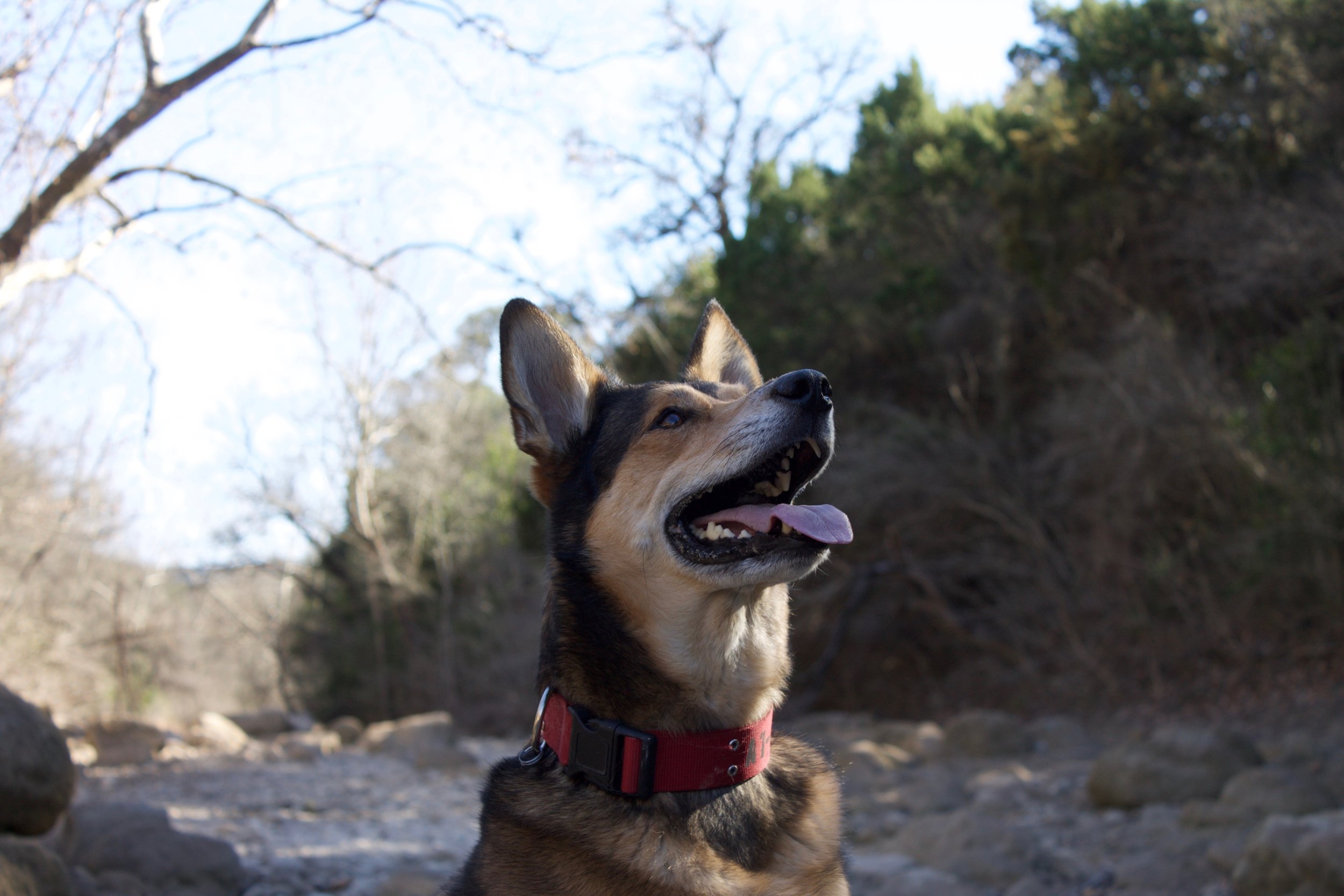
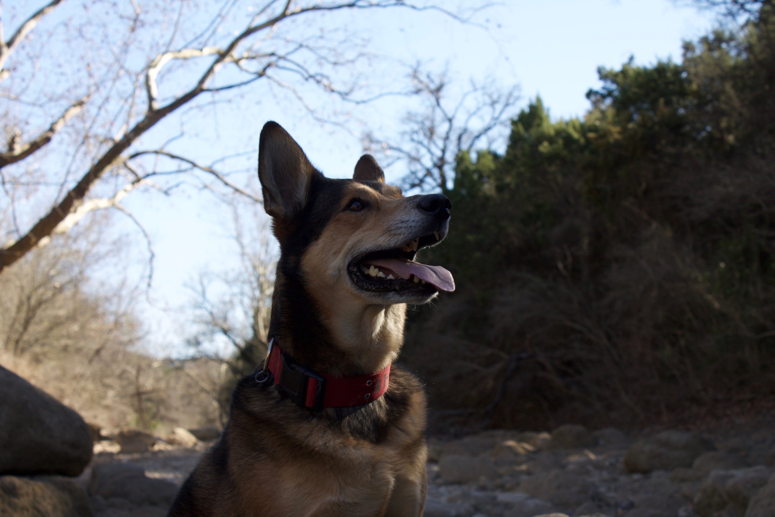
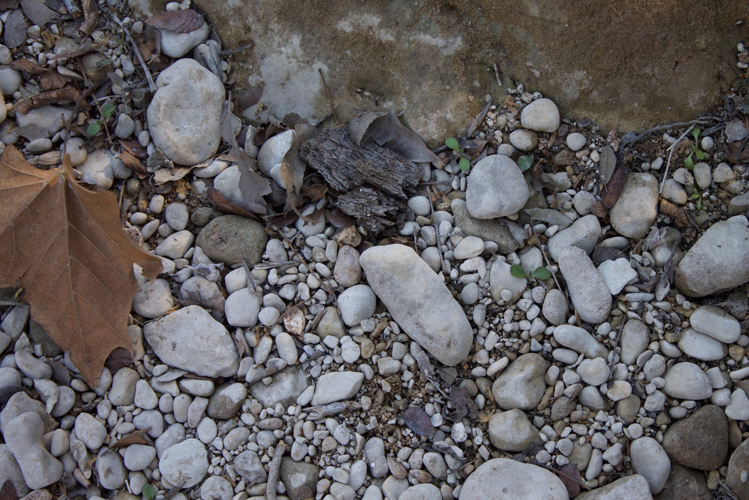
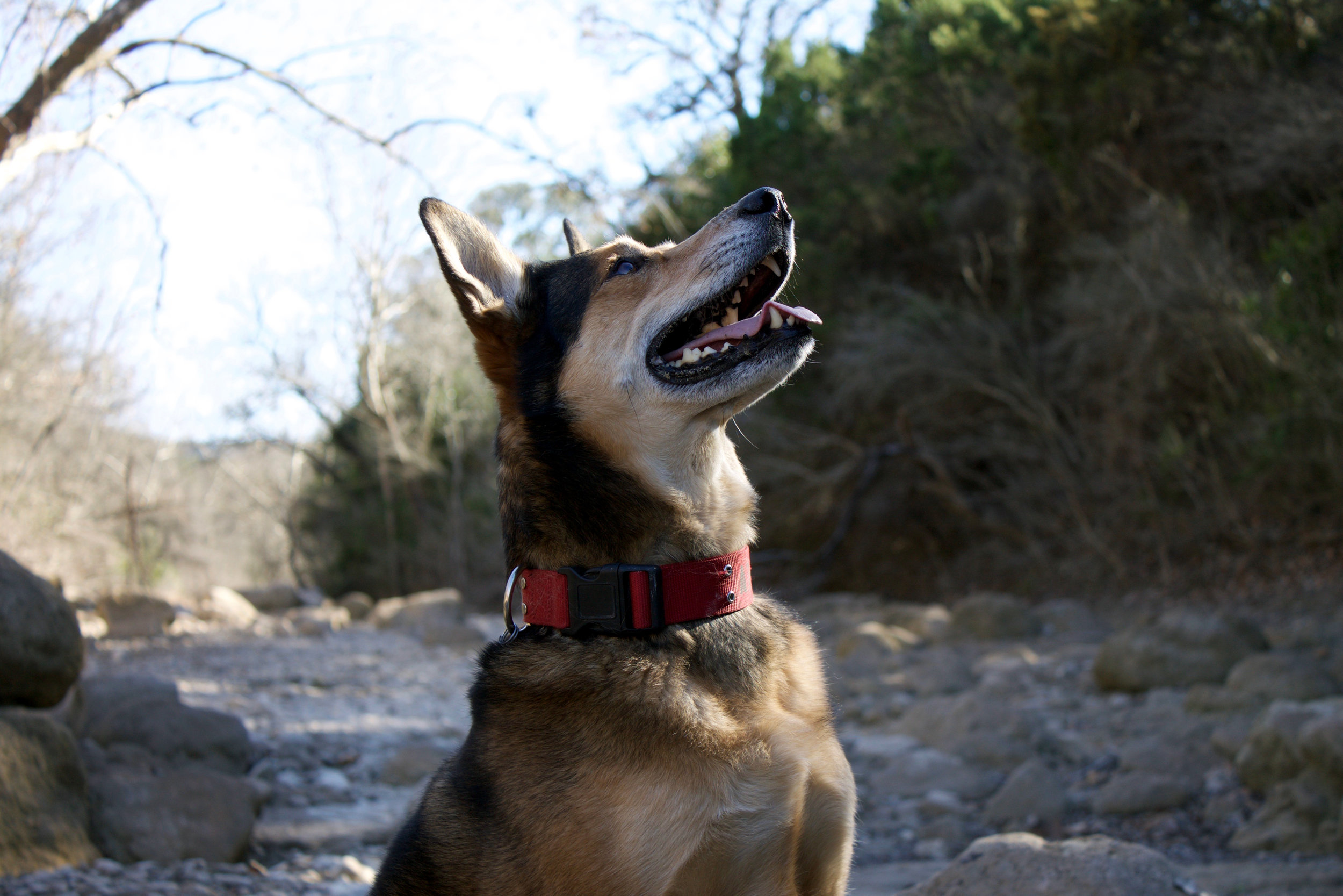
My first step was to gather information on location. I went to the Greenbelt and collected 16 audio clips and 90 pictures. Below are a taste of some of them.
Through listening, I’m able to understand the white noise of the Greenbelt, at least at its current state. Online research would make it seem like it sounds like splashing laughter and feet rapidly running across stones. Rather, it is distant notes of freeway traffic with the occasional group of two or three quietly discussing their day. The sounds solidify the aura described within my photography.
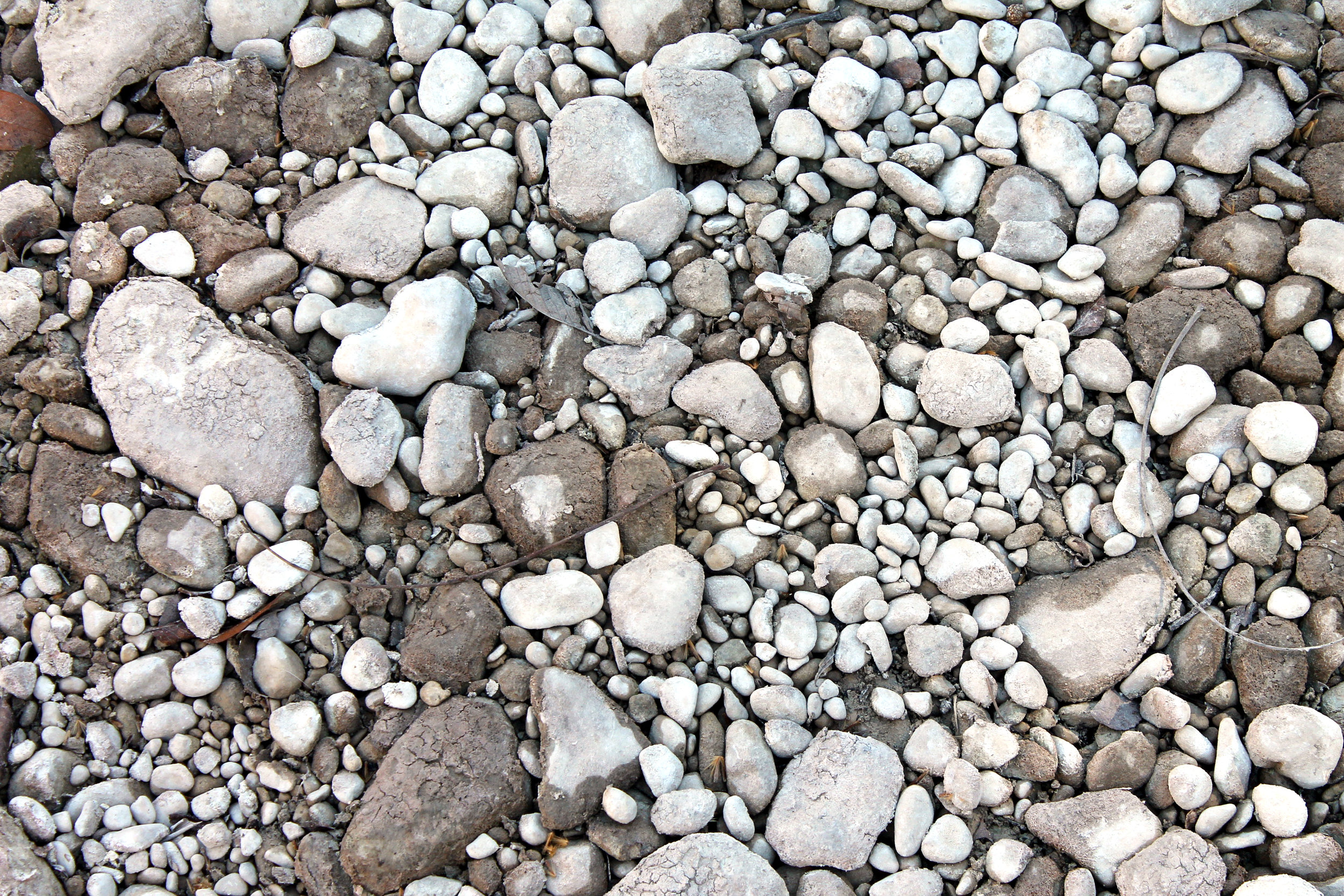
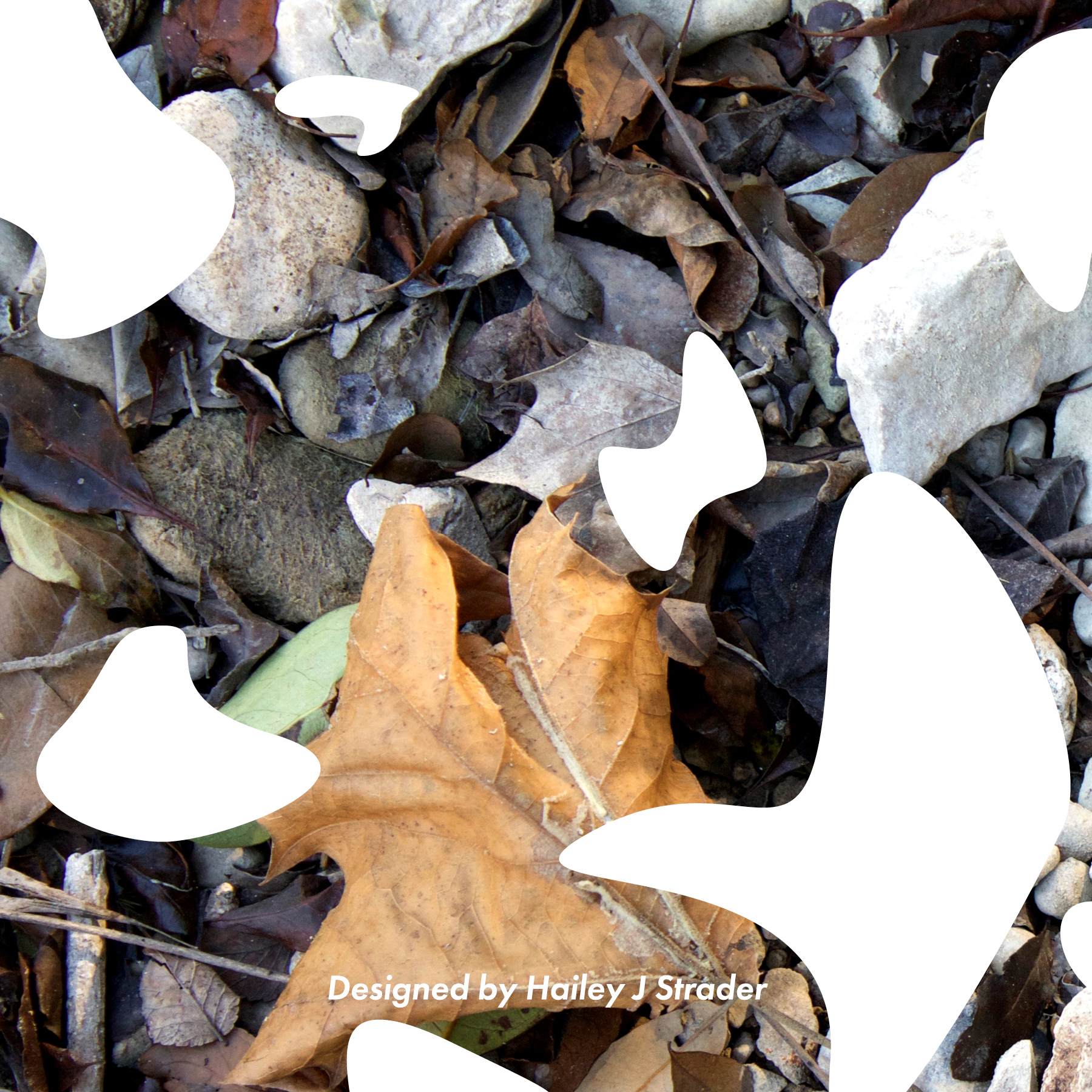
When collecting pictures for my repository, I was interested in how textures and details convey the emotional atmosphere of the Greenbelt. Due to the timing of my research, the cold weather and lack of water has left the belt generally dead. But there are still bits of new life creeping through mud-cracked rocks and withered leaves. The Greenbelt isn’t anywhere close to reaching the population it will over the summer, but Austin hasn’t left it abandoned either. Nature has such a huge factor in the atmosphere of the space, and I wanted to document that change. Through photography, I was able to capture the textures beneath me, as well as a bit of the general environment.
Next, I collected historical information on the Greenbelt, from the origins of the creek to news stories on its dangers. This would serve to be the basis of the text inside the booklet.
Processing the Information
After gathering information, I began processing. I made a mark for the Greenbelt and a mission statement to go along with it. I also constructed a mood-board to aide my visual process.
The Greenbelt is an intersection, blending the line between fast paced city-life and peaceful greenery. It is the meeting point between two worlds. The crossing has no social or economic barriers. Visitors can continue on their path or make a different turn. We need these intersections to keep moving. Sometimes we need them to slow down. This cross of gravel and pavement reminds us how beautiful and necessary the blending of multiple worlds can be. I wanted to make this image an outline to explains the simplicity of it. The path coming towards the viewer is the organic gravel road that has been cut by a concrete block. This shows the overlap urban life has with nature.
Creating the Mark/ System
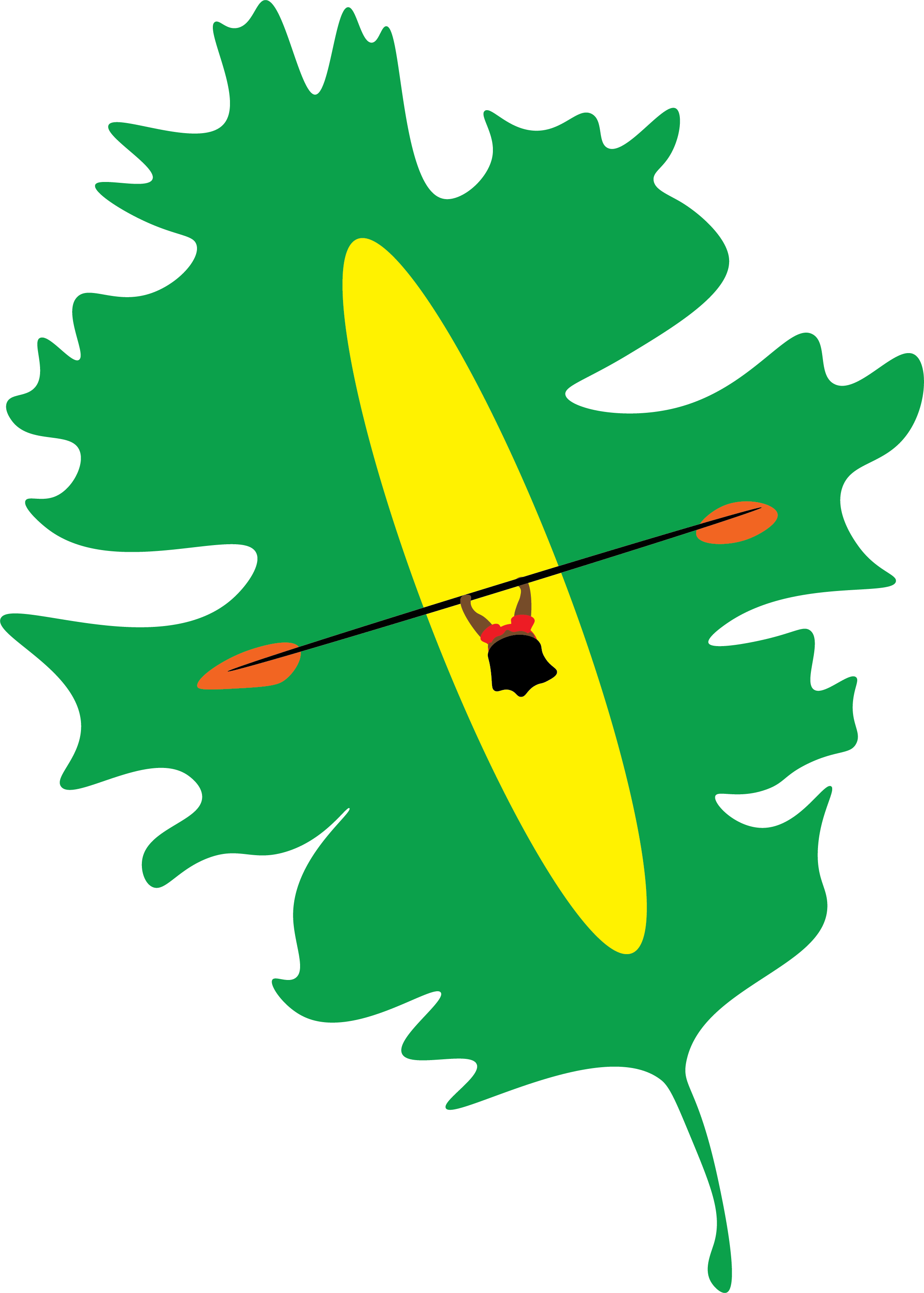
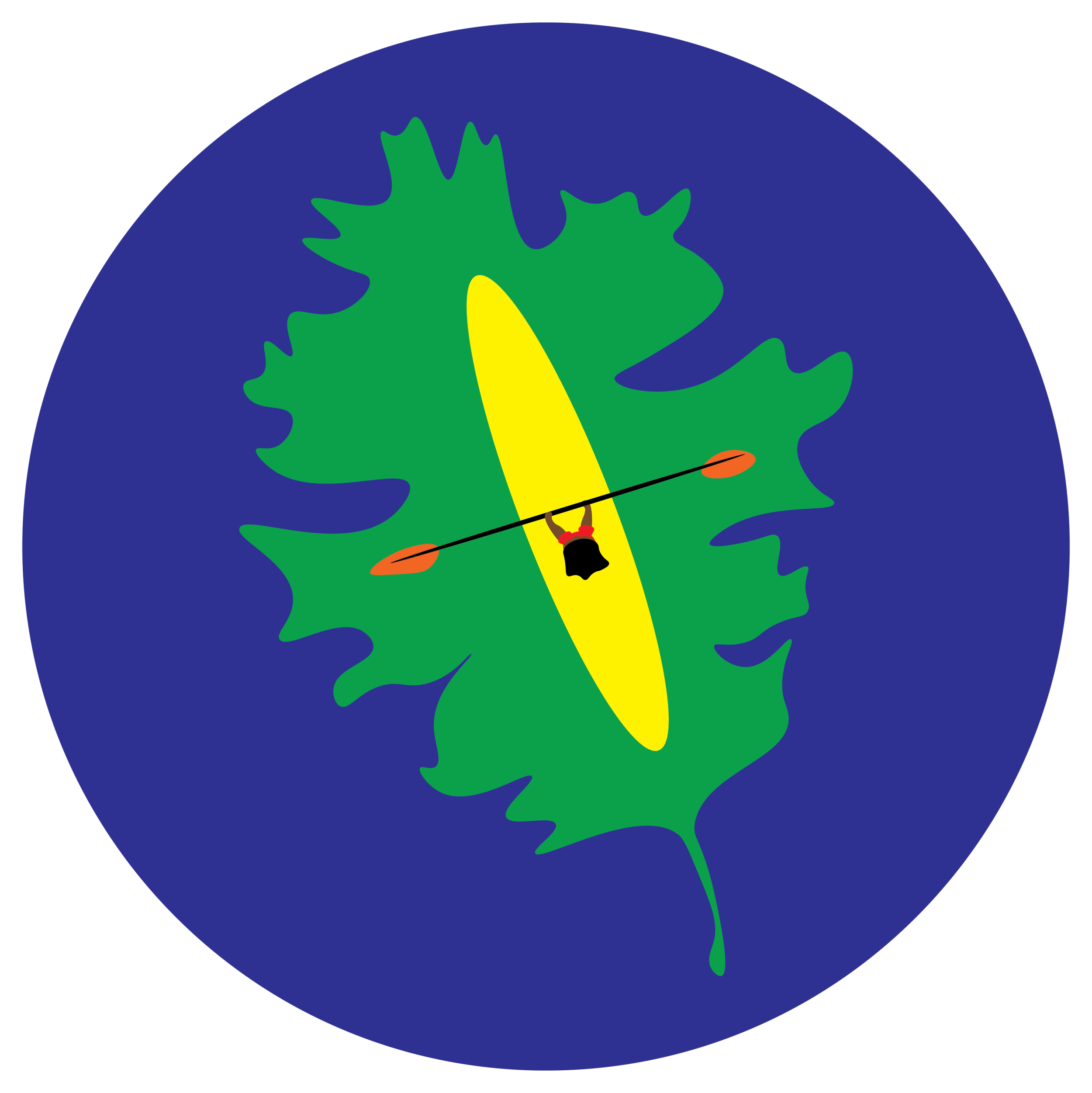
In my final marks, I strived to create a system that could be iterated multiple times with other ideas. To make the marks feel personal and connected to the creative Austinite culture, all of the images employ a hand-to-paper quality. To reflect the vibrancy of Austin and the Greenbelt, I used solid color blocks rather than shading and highlighting. The typeface used is “Futura” which has many different styles to allow for variety within consistency. Most importantly, all marks must explore the crossover between city life (or people in general) and a green landscape. After a final critique, I decided to leave behind the first two marks and expand on the last leaf one. This was the most effective piece and will end up being a huge part of my patches application later down the road.
Patches
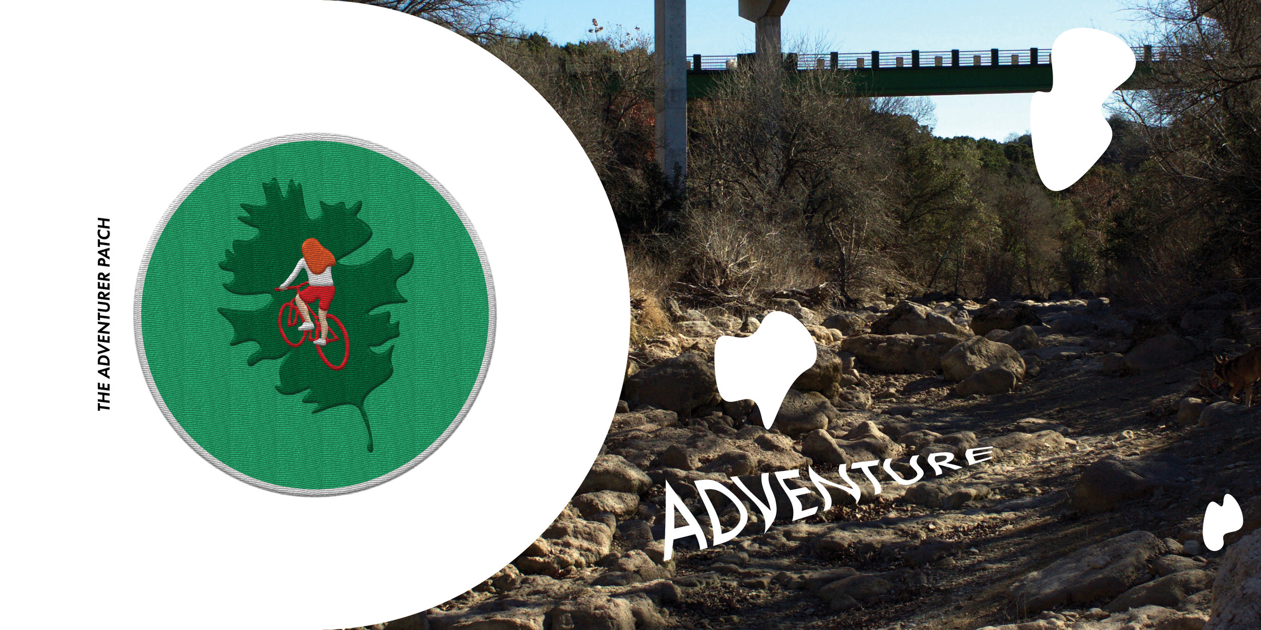
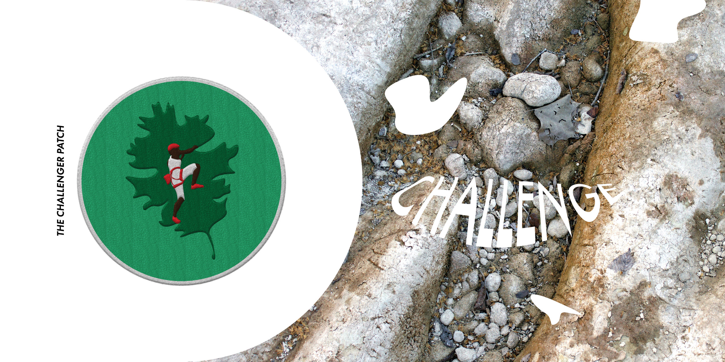
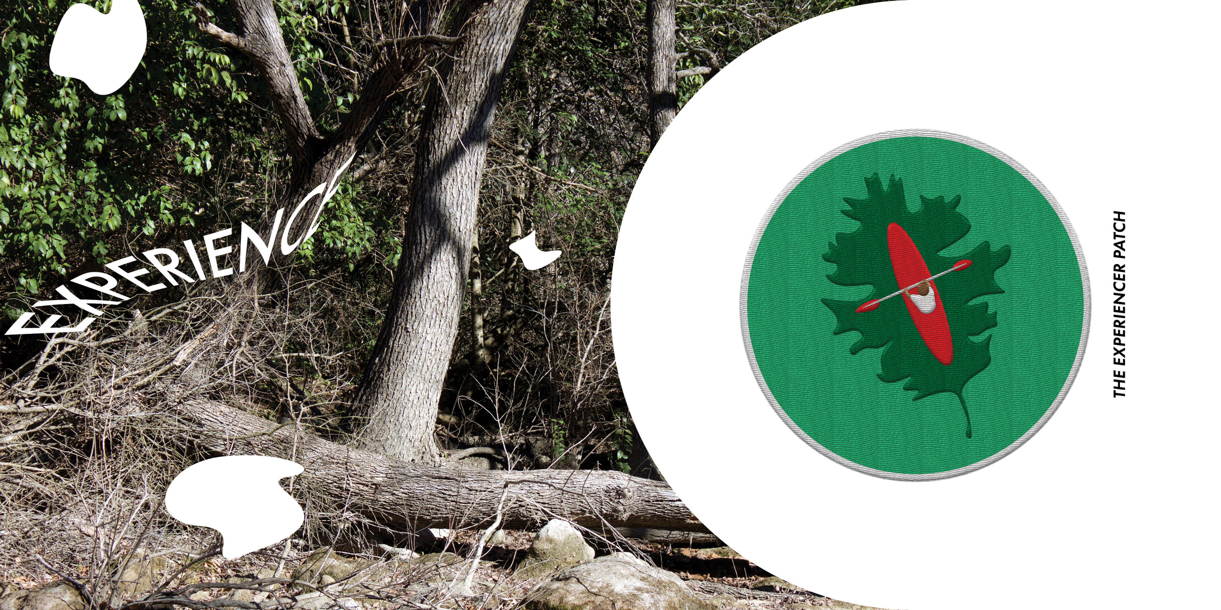
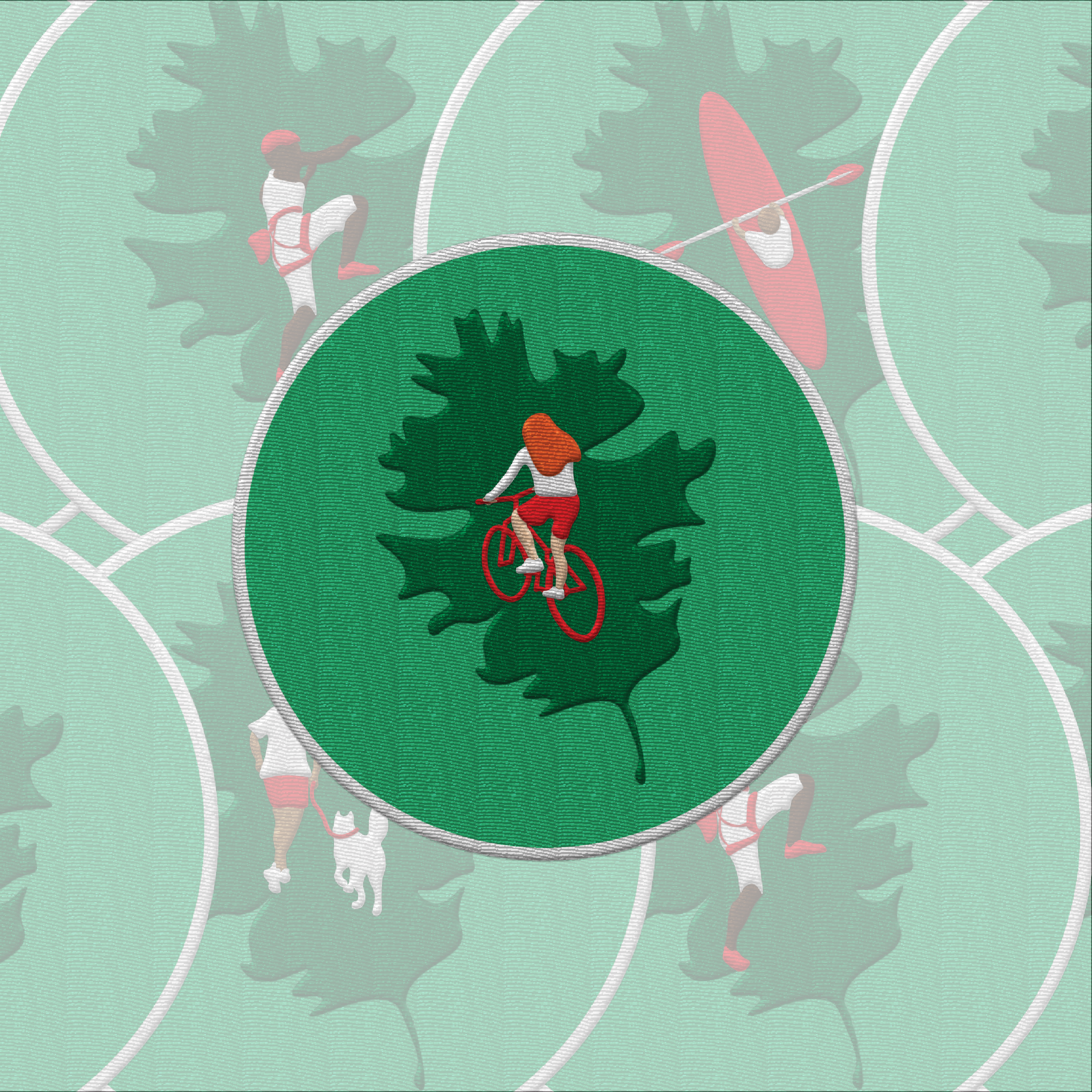
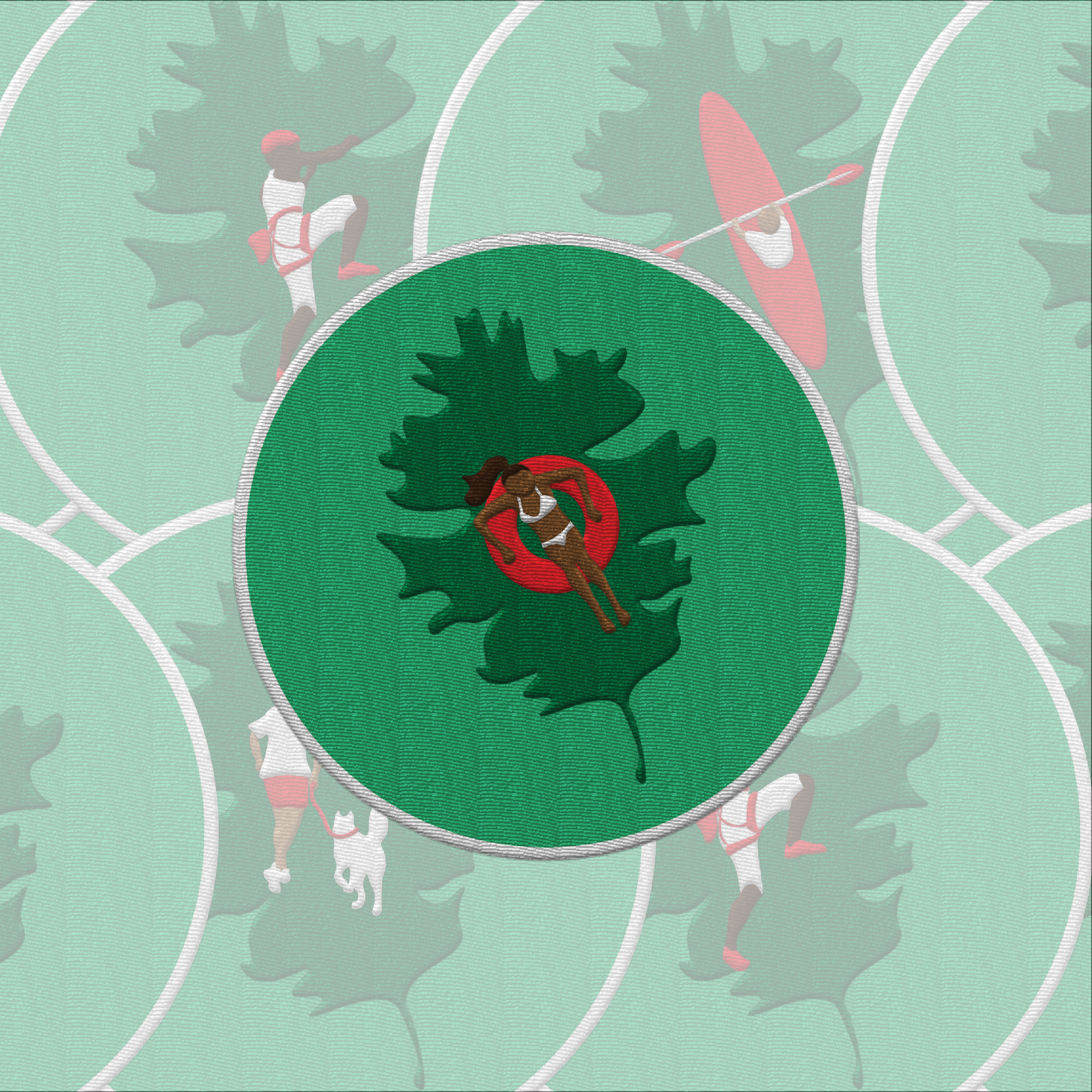
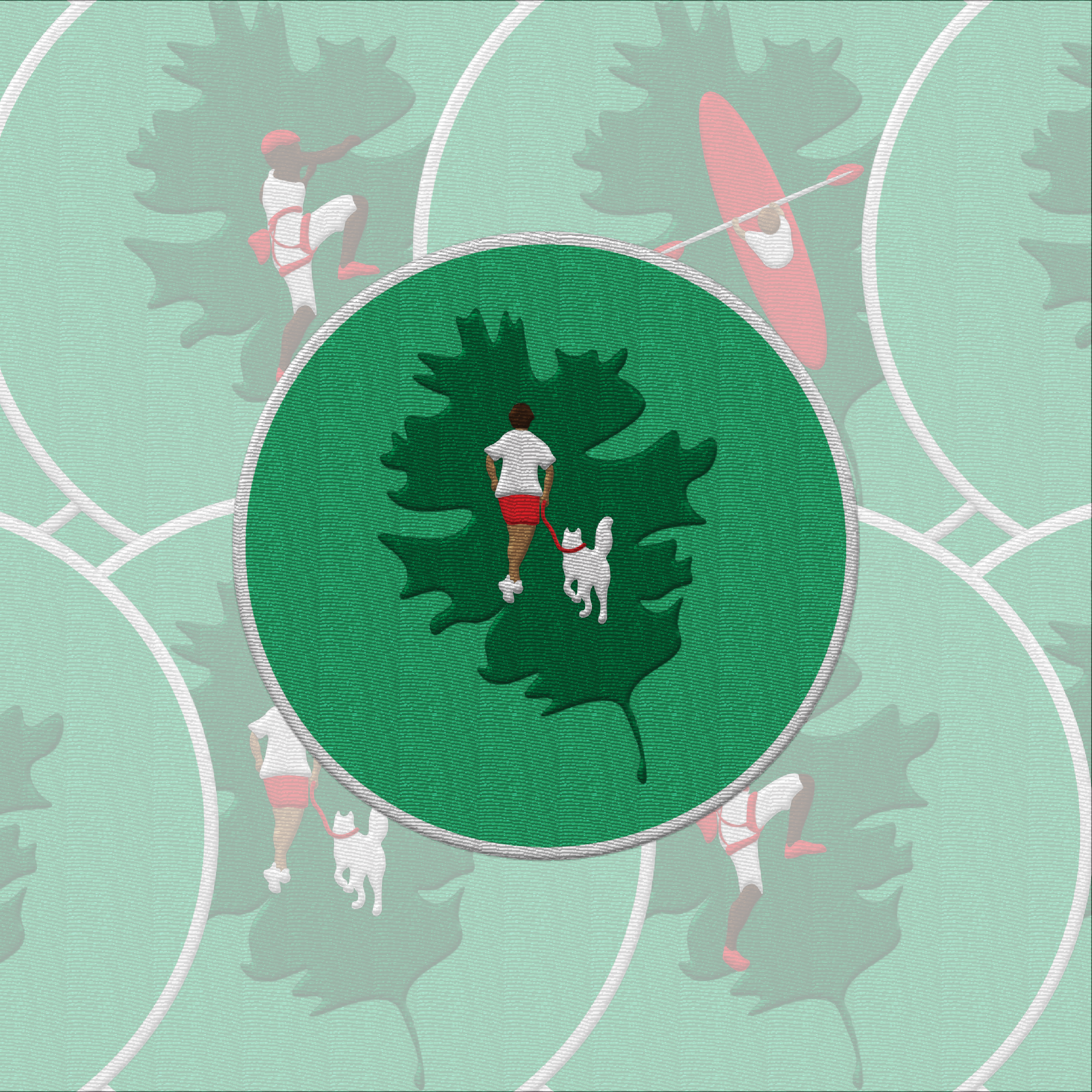
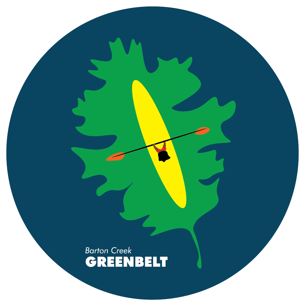
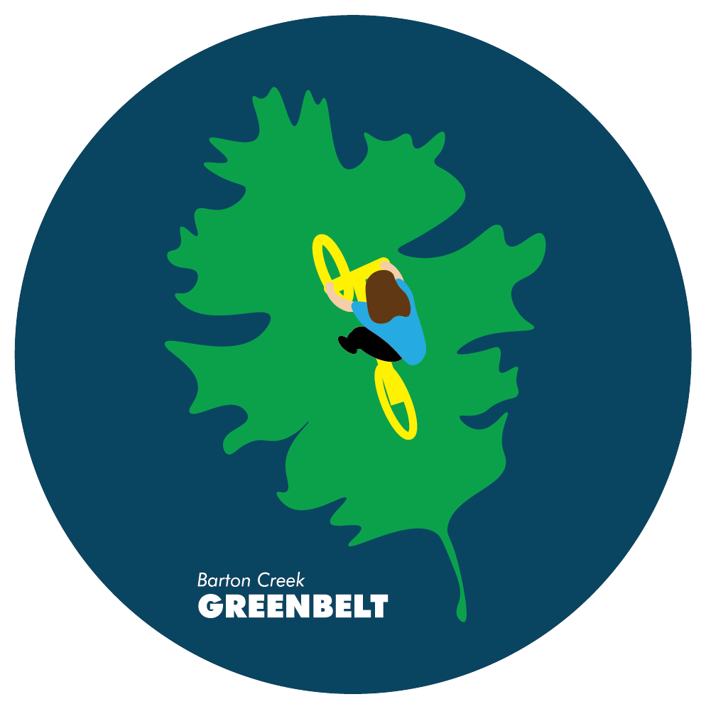
Through many revisions and critiques, I finally designed my final five patches, all based on my initial leaf and kayak mark.
Patch Design: Phase 1
Patch Design: Phase 2
Patch Design: Phase 3
Final Patch Design
The Book
My first step was to lay out all of the content for the book, including the narrative, pictures, and products that would be featured (aka the patches). Then, I edited the pictures that would be used inside the book for color and clarity.
The Book: First Draft
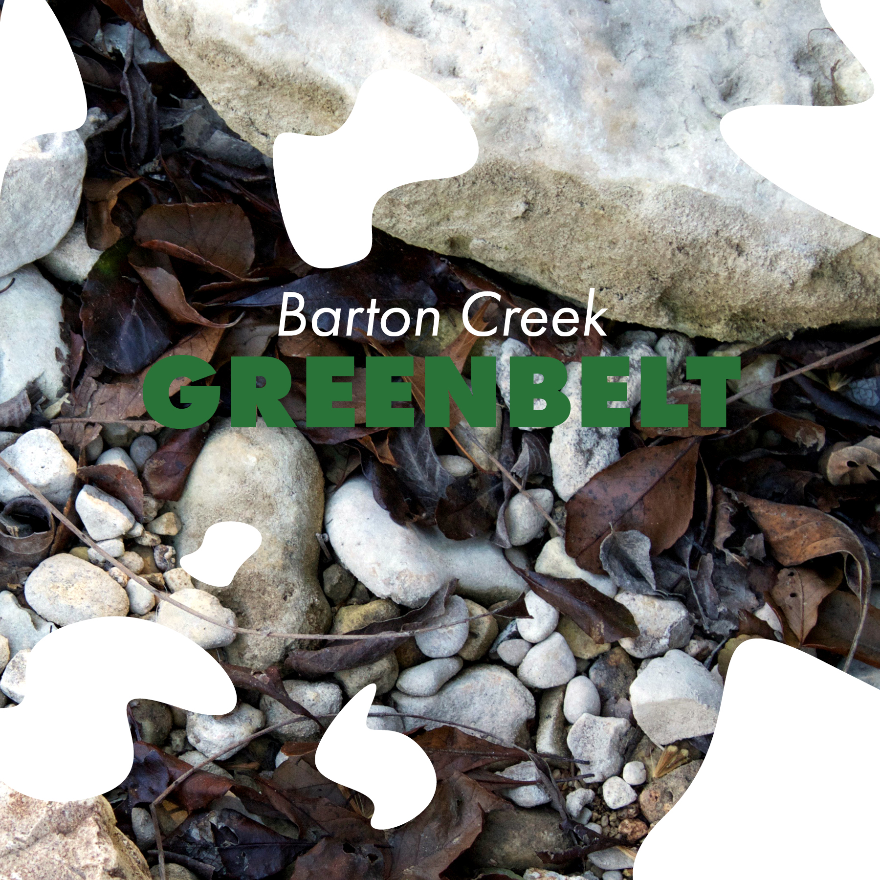
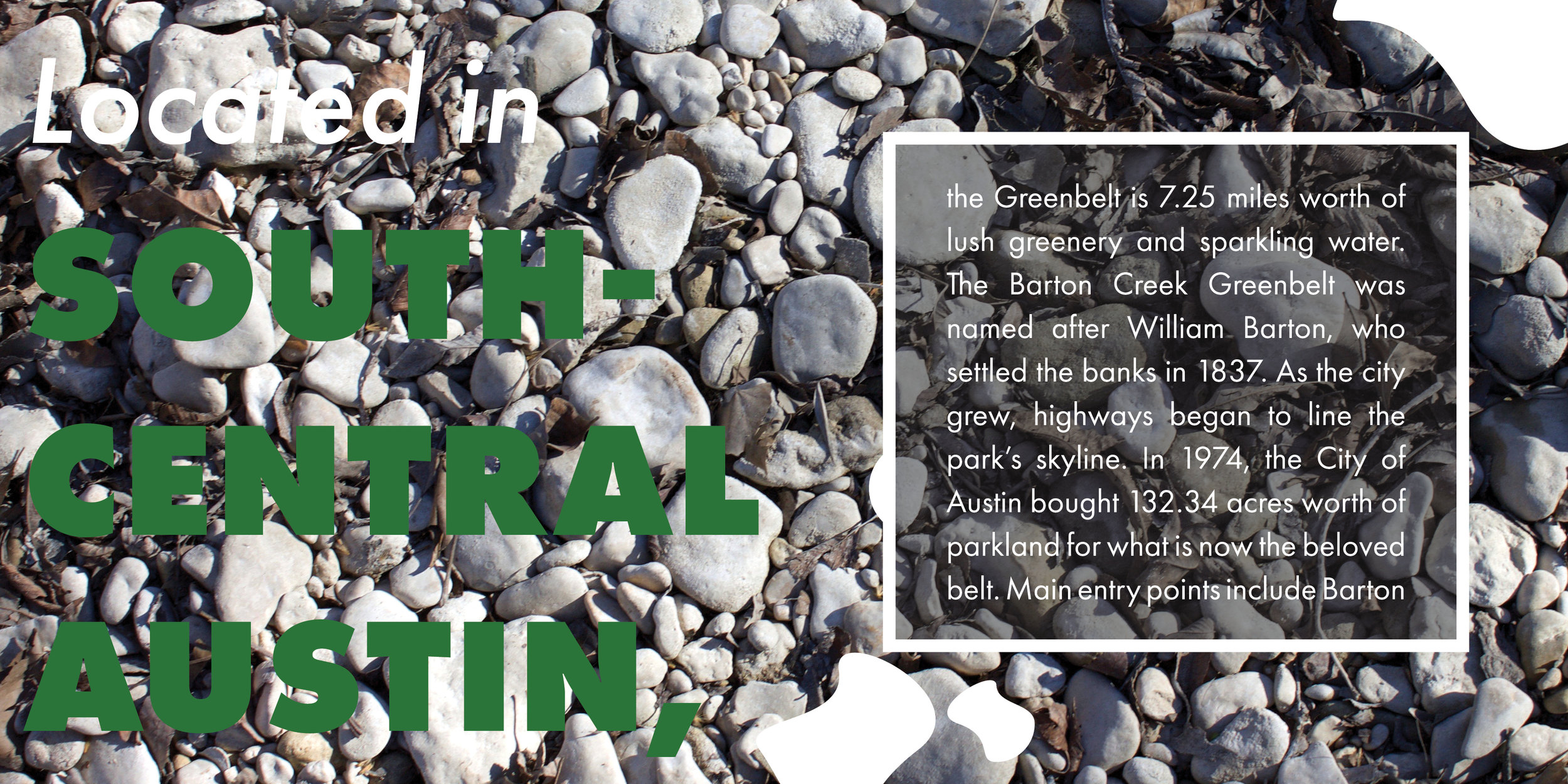
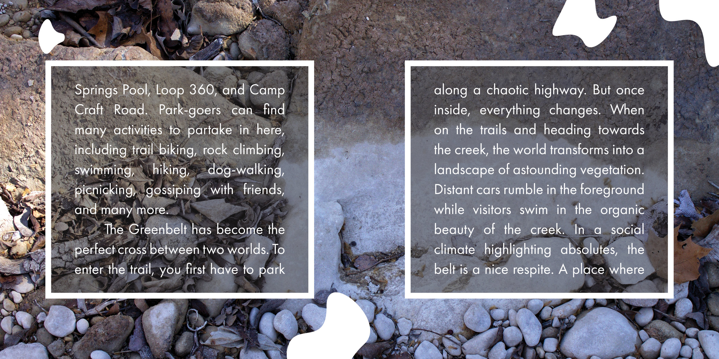
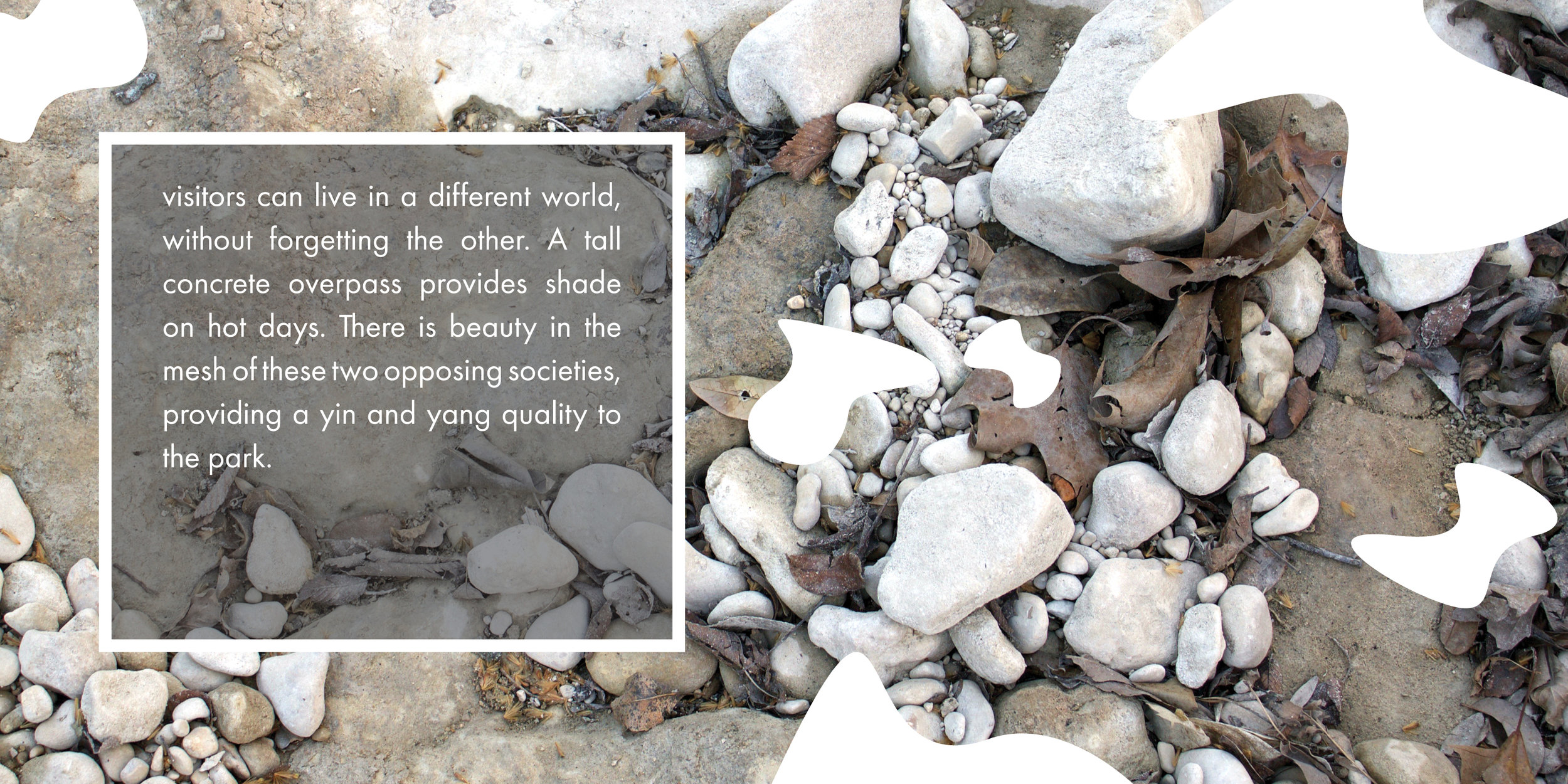
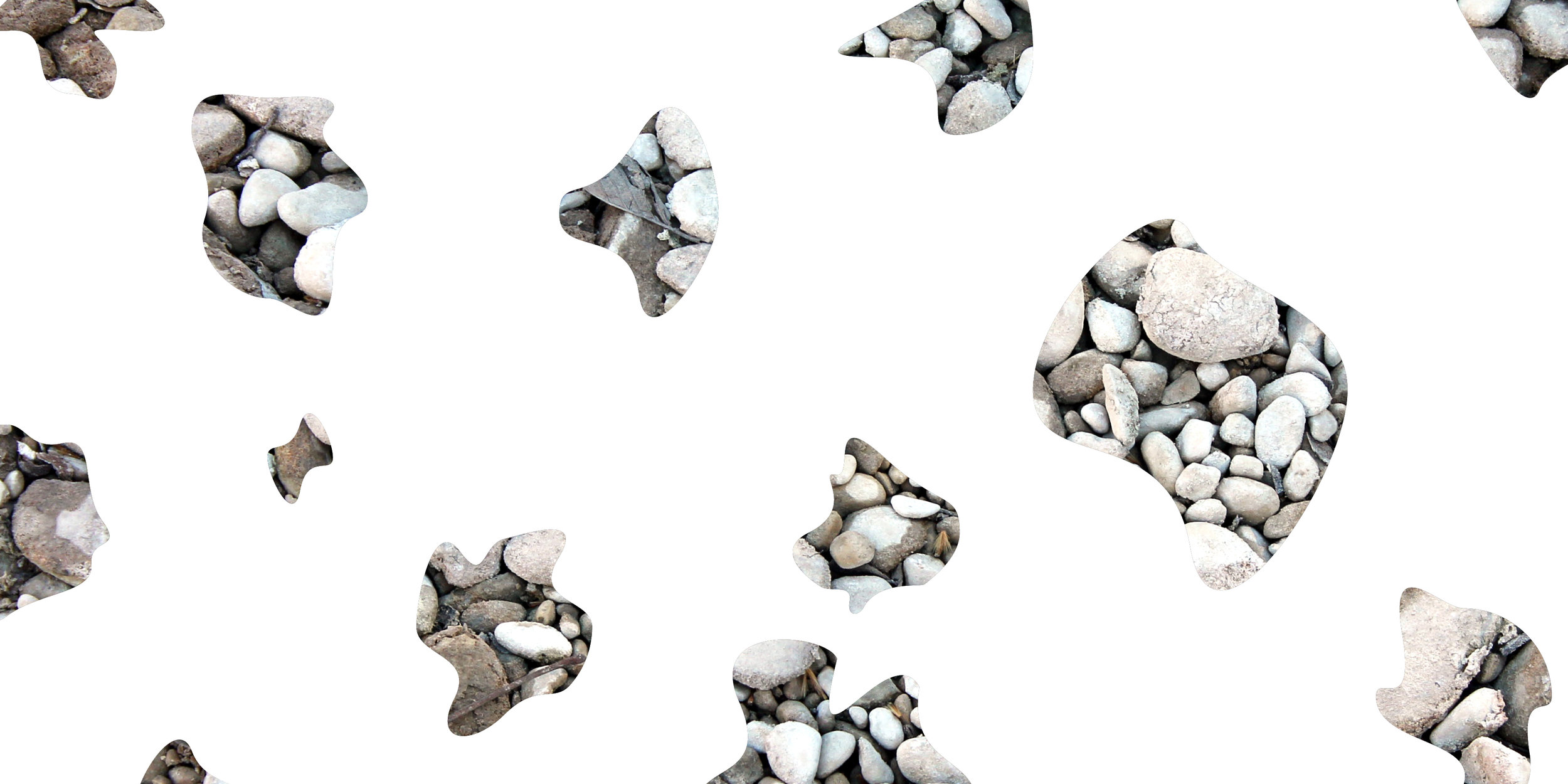
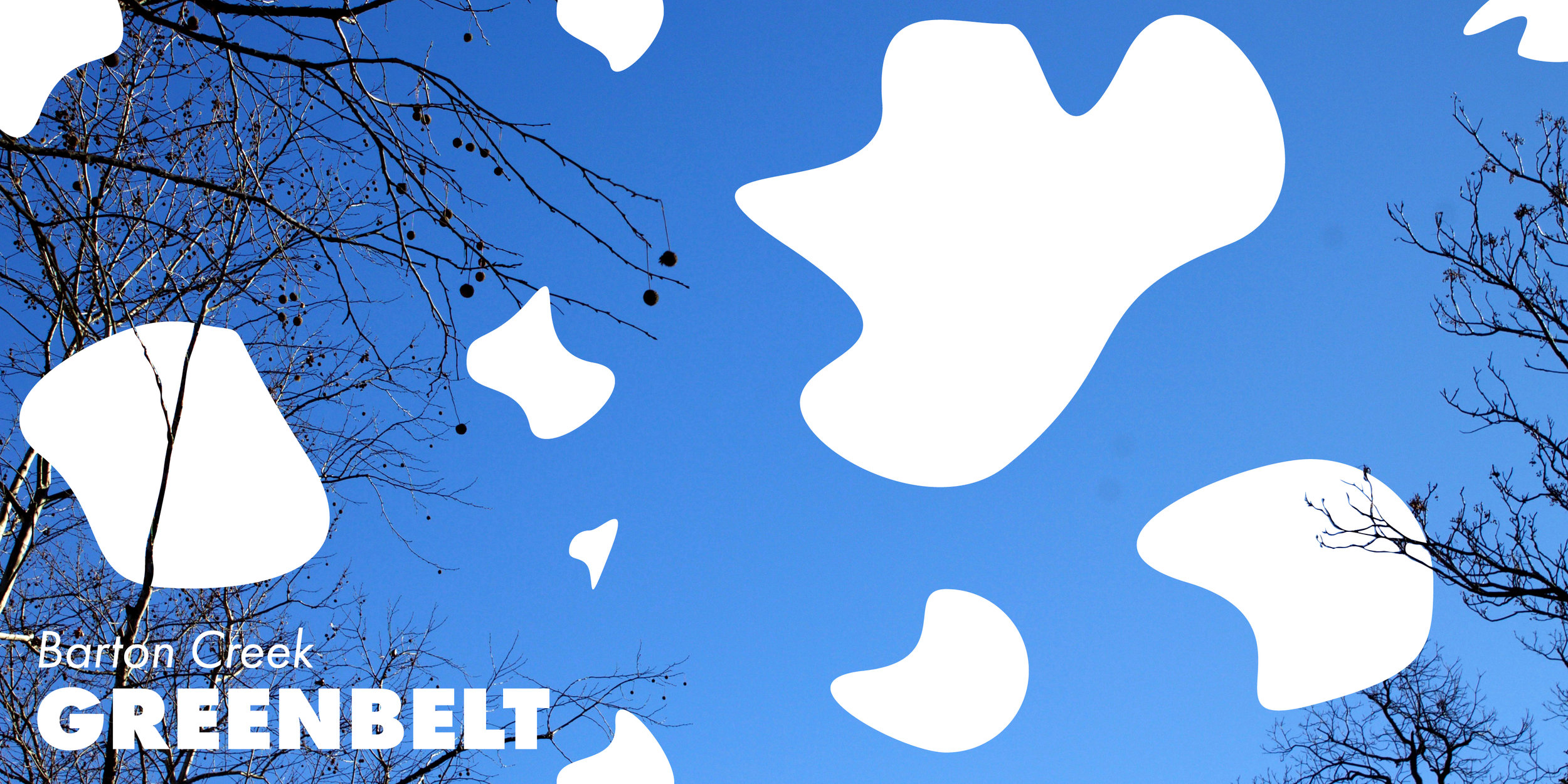
My first draft of the book used circular shapes to explore the fun and wonder of the Greenbelt. The photography focused on the rough texture, while the vector shapes bounced over them. While reviewing my first draft, I felt like the circles and the pictures were too separate, so on my final design I focused in on having the vector files play with the photography more.
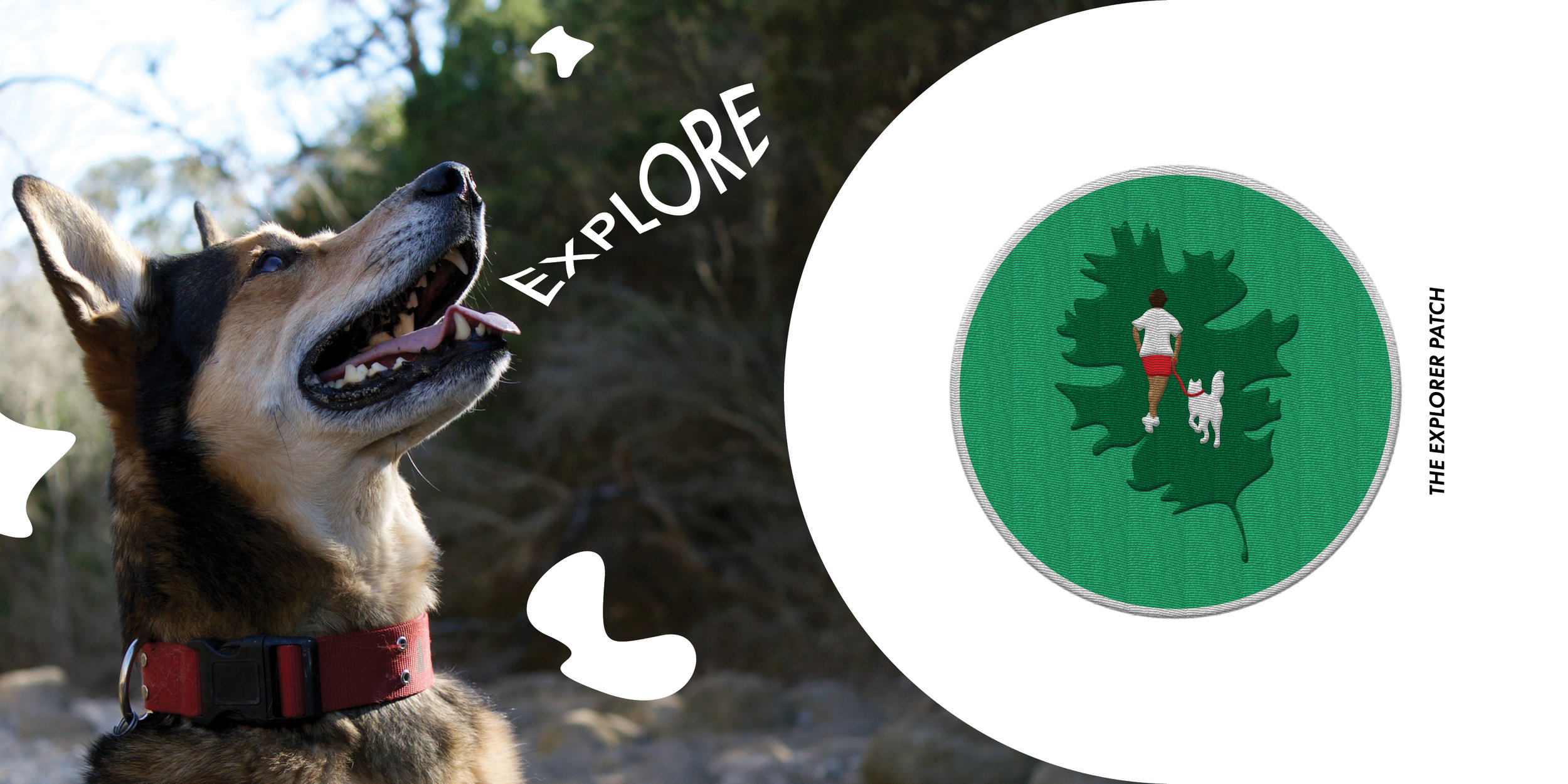
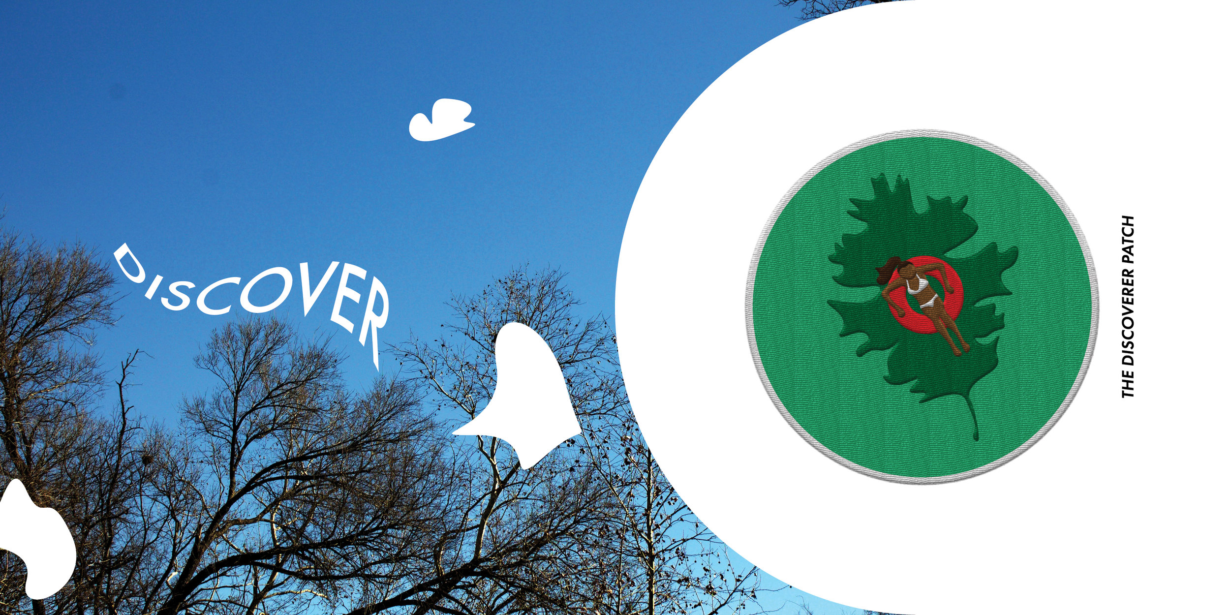
Final Book Design
I expanded the text to span multiple spreads for easier readability. The white shapes became more organic in the final stage to reflect the rounded rocks in the Greenbelt. I named each of the patches and create words that interacted with the pictures to add movement and interest across the spreads.


